
Mikkie Mills
Post Date: Aug 23, 2019Posts
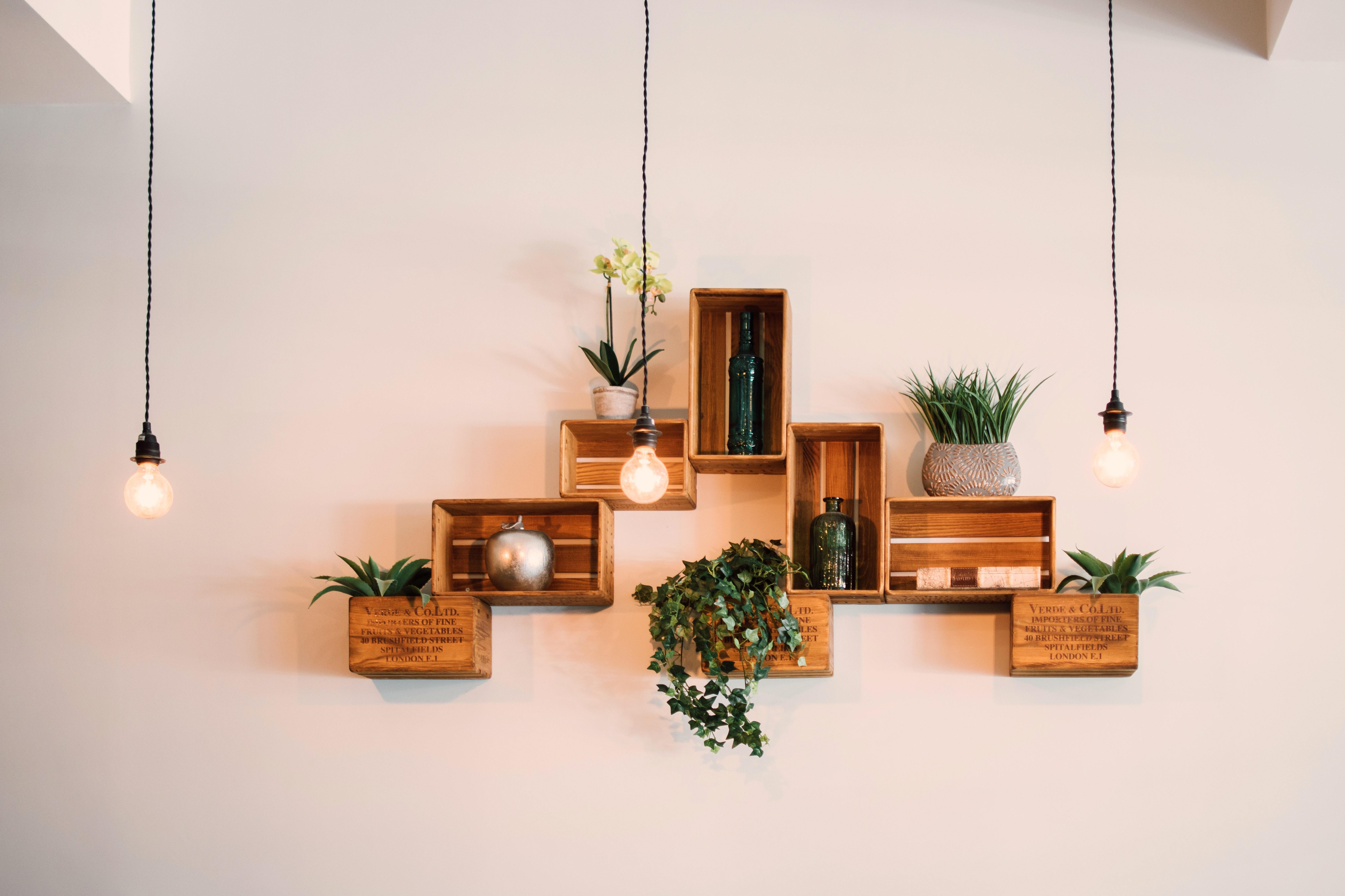
The Art of Choosing Art in the Workplace
Figuring out the correct decorations for your workplace environment is in itself an art form. Although there are many categories which could satisfy your workplace policies the number one category to consider is whether or not your art is appropriate. Hanging up your online paralegal certificate does not count as decorating. There are better ways to sophisticate your office.
Appropriateness
Appropriate is a relative term in the sense that something appropriate in one workplace environment might not be appropriate in another. For instance a motivational poster of someone running on the treadmill with a statement like work hard or die might be appropriate at the gym which you are a trainer.However,any type of poster with the phrase die in it would be totally inappropriate at my oncology office. In instances like these it's best to focus on the people who may be offended or hurt by the art which you've chosen to present. Once identified you can simply try to avoid these pitfalls and save yourself.
Relativity
Relativity refers to whether or not the piece of art you are trying to show off is relatable to your workplace environment. Although something might be appropriate if it isn't relative to what you're doing and what people are experiencing than this can be viewed as a faux pas. Also this is where people who are great at decorating their officers shine because they can find the most relative and interesting pieces. A piece which is relative can draw attention and drum up conversation especially with the type of person relative to your workplace environment AKA the customers or patients, etc.
Color Schemes
When it comes to color schemes there is nothing I like better than a Red Orange Yellow Green Blue Indigo Violet range, however sometimes the color scheme you need to work with is much more subdued. You must pay close attention to your environment surroundings in order to match the colors with the mood that you are trying to portray. I wouldn't put brightly colored vibrant pieces of art in an area where I generally want people to relax and calm themselves. Likewise in an area where there is a rambunctious activity I wouldn't want to use flat subdued Gray tones. In an area where you would like to drum up some life such as hallways of clinical environments You can introduce some landscape photography or portraits of past happy customers. Think of things that would bring happiness and peace to your customers or patients.
Neutral Art
In my opinion neutral art are things which can be used in multiple situations. Depending upon the environments they are in people will see different things. Geometric shapes or random fractal patterns are some of my favorites. Natural items that contain patterns are in the same category to me such as the Fibonacci sequence of nautilus shell or the fractal fragmentation of insect eyes. You don't need to literally put out a nautilus shell or insect eye, but utilizing such repetitive patterns as are found in nature tends to bring calm relativity to any situation since we are all in fact of nature.
Personality
If you are trying to show people and little bit of insight into who you are it is important to find something which you relate to. This form of art work will generally be displayed in one's own office and not in a common space within the workplace. Pictures of your loved ones and family fit into this category. Maybe a personal painting or a photo of a place you love to visit fits. Even a caricature of your favorite cartoon character can me personally meaningful. Also books which are personal to you can be displayed in a form that is meaningful.
Utilitarian
The last form of art which I prefer the most is utilitarian, something beautiful which can be used. A lovely winged chair as an example. A gold pen can be art as well if displayed.