Pratt Celebrates 125 Years of the Wall Street Journal
-

- August 19, 2014
- Laura Blum

Byline: Laura Blum
New York, NY - Say you're an art student. And say you have a brief: "to creatively represent the past, present and future" of a 125-year-old newspaper. Now say that paper is The Wall Street Journal. Chances are, if you've ever glimpsed the business- and economics-focused daily in broadsheet form, images of dot-ink portraits are already vibrating in your mind's eye.
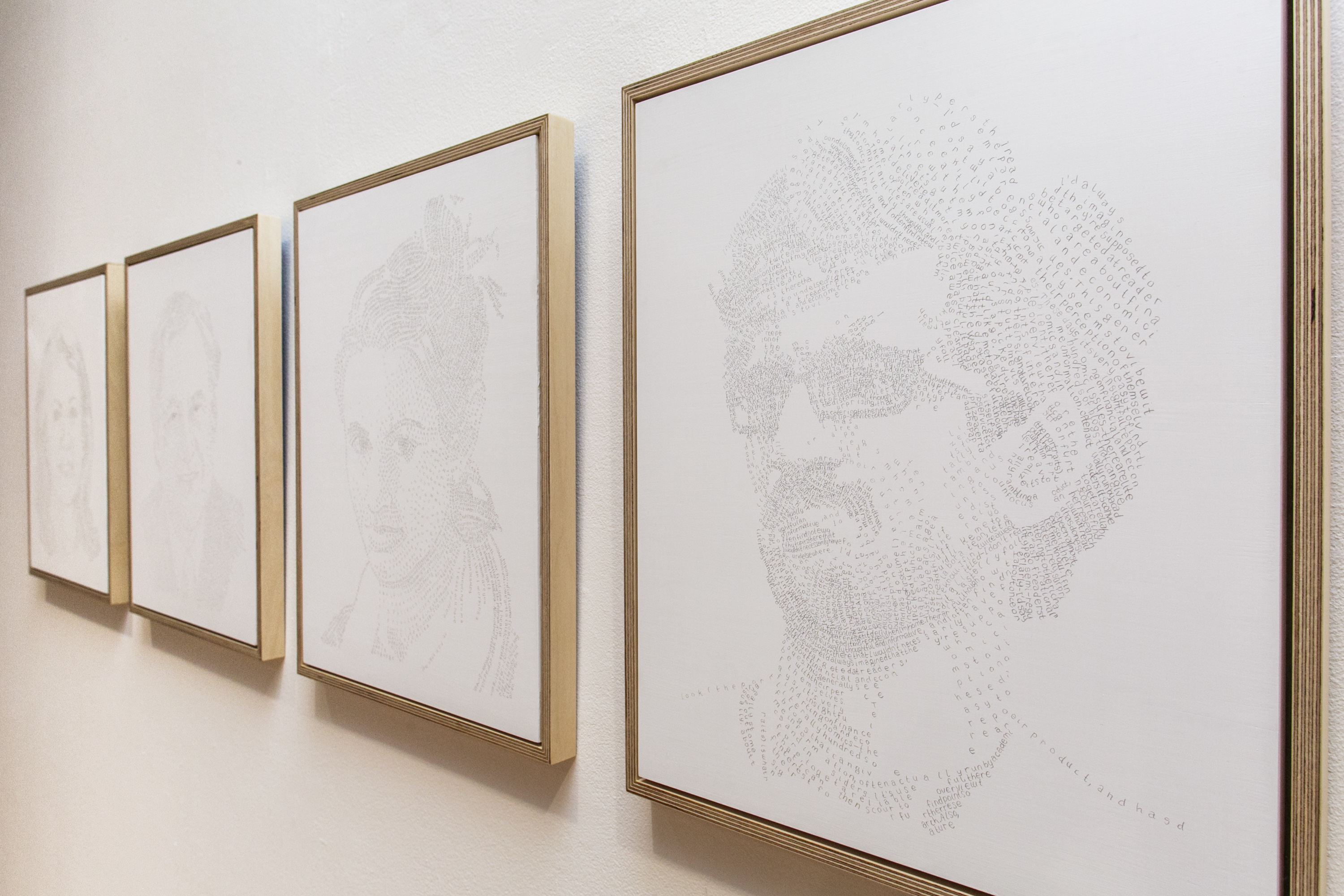
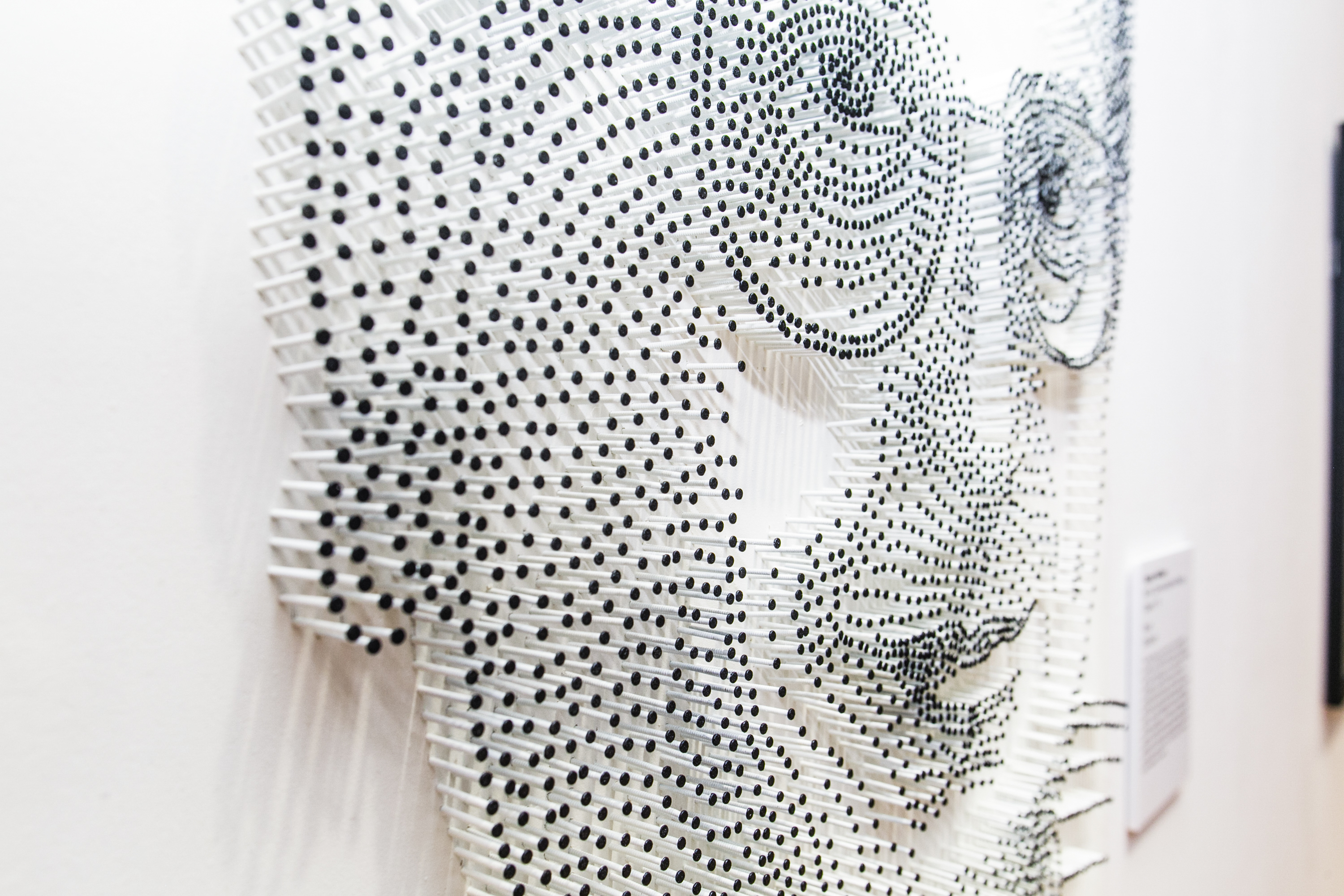
So there's nothing particularly astonishing about the fact that the winning entry of Pratt Manhattan Gallery's current exhibition, Pratt Celebrates 125 Years of The Wall Street Journal, exhibits@pratt.edu riffs on The Journal''s trademark hedcut. What is surprising about Michael Levin's Section 8 is that predictablility doesn't detract from its totemic allure (as seen in photo 1). Nor is there anything ho hum about runner up Saana Hellsten's Wood, which is similarly inspired by the Dow Jones publication's 30-year-old tradition of stipple drawing in pen and ink (as seem in photo 2).
Levin and Hellsten are among 11 students from Pratt Institute tapped to submit works for the anniversary show. Prizewinners were selected by fellow Pratt students and Journal representatives including executive editor Almar Latour. Dow Jones dangled eight themes for the students to draw on, ranging from the impact of technology on media consumption to The Journal's evolution from a four-page bulletin in 1889 to the global news juggernaut it is today.
Beyond student artwork, the celebratory expo features archival material reflecting The Journal''s landmark coverage and developments. To survey headline events spanning the 1898 explosion of USS Maine in Cuba, Japan's 1941 attack on Pearl Harbor and "The Week that Wall Street Died" in 2008 (but curiously, nothing about the Great Crash of 1929) is to beg the question: why did The Wall Street Journal choose art as the medium to express its 125th? The angle, as Dow Jones and Journal spokesperson Colleen Schwartz put it, was to capture an "everlasting artistic embodiment" of the outlet's history, culture and journalistic standards "while also representing future possibilities."
Section 8 was judged to do so with universal resonance, Schwartz reported. The four portraits that make up Levin's work will reap the big bounty after Pratt Celebrates closes on August 21: permanent installation at the Dow Jones corporate office in New York. Starting out with the signature hedcut let Levin think about the paper as a forum for tête-a-tête engagement with its readership. This was the idea behind his solicitation of four Journal readers to jot down whatever came up for them about its 125 news-breaking years. Each participant's response supplied Levin with the material to compose his or her likeness, using letters in place of the usual pointilist flecks.
thalo.com reached Levin for some brainpicking of our own (as seen in photo 3). Were his hedcuts inspired -- consciously or not -- by pictures using keyboard symbols? Did the grid work of photorealist legend Chuck Close get him going? The MFA candidate (Class of '15) came back with a negative on the ASCII art, but with a clear affirmation that Close's "large-scale portraits using fingerprints" had indeed lit a spark. "A larger influence in my work is something called micrographic drawing," Levin offered, explaining that this "practice of making pictures out of tiny letters...is mostly found in religious art, where the text of prayer or psalm is used to create a picture."
The medium in which he inscribed his handed-down litanies is also what gives Section 8 its ethereal quality. "Silverpoint, unlike most other drawing mediums, goes on very light and has a pretty low threshold for how dark it can get," Levin noted. Asked if he was intentionally going for a gauzy, evanescent feel, the Pratt artist responded, "The lightness of the drawing was an aftereffect of this choice, but one I welcomed on the grounds of my personal taste."
A more intriguing story is what his aesthetic brings up. "It was important for me conceptually to use silverpoint -- which deposits silver on the surface to create the drawing -- because of its various symbolic associations: anniversaries, coinage, etc."
If Levin's avatars stare out from an undefined moment in time, Hellsten's single 3-D hedcut announces its presence more palpably in the here and now. Contoured with black-tipped white nails, Wood yields a close study of reinvention with all its insinuating mischief and possibilities. "There's a bit of an inherent wink in turning a thumbnail-sized style of portraiture into a large-scale piece made of nails," Hellsten shared with thalo.
Yet while exploiting the theme's potential for irony, the Communications Design student (MFA, '15) brokers a sensitive, even tender introduction to a persona long relegated to non-newsy oblivion. "The medium takes delicate to the extreme, while shifting focus to a man who works behind the scenes at The Journal," remarked Hellsten. However playful the arcane pinball-machine-style execution, her bas-relief is meant "to bring awareness and a greater appreciation to those whose work isn't typically recognized publicly," she said.
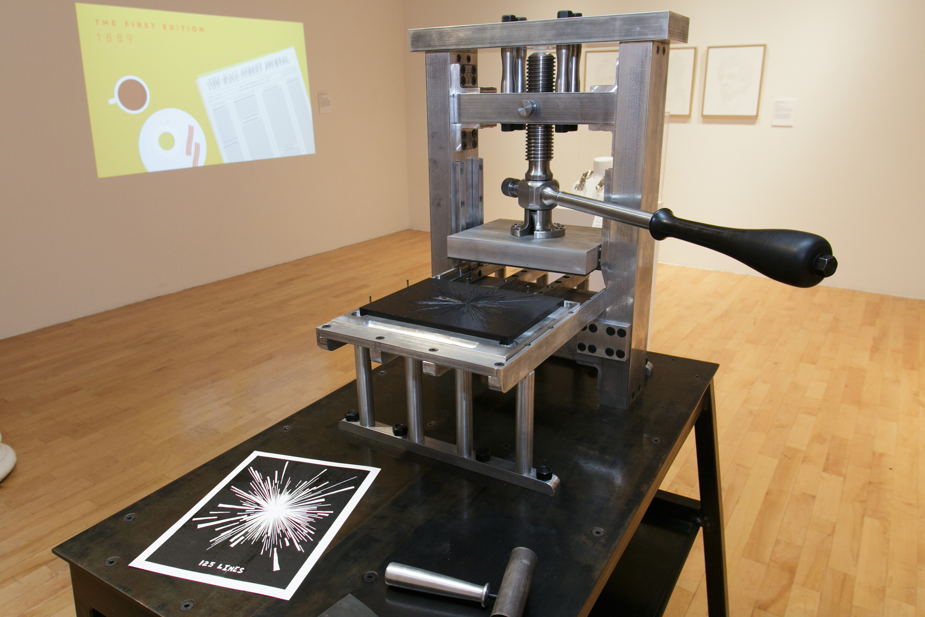
Sharing runner-up honors with Hellsten is Saul Schister (BFA '14). To mark the birthday of the nation's largest-circulation newspaper, he hand-crafted a modern printing press (as seen in photo 4). "Today massive printing presses churn out the newspaper," Schister reflected, adding, "I wanted to revisit the first printing press, the Gutenberg screw-driven press, and reinvent it." The Fine Arts major opted for aluminum, steel and brass over cast iron and wood. But as he pointed out, "The mechanism itself is still a handle turning a screw, driving a plate down upon a piece of paper, the same way it was in the late 15th century." For him, "this preservation of the original function of disseminating information" captures The Journal''s lingering core values in the modern era.
Schister's regard for vintage printing techniques was honed during a year of printing on a cylinder press at Pratt. All of the component parts of his exhibition piece, entitled Modern Single Pull Printing Press, were first cylinders, rectangular prisms or plates of material before he altered them. Schister wants viewers to grasp that "everything starts out as these rough blocks and then is manipulated in order to form parts that make up a whole."
The 20-something sculptor's love affair with physical creation hardly carries over to digital rendering. "My experience with digital rendering was mediated by a computer screen," mulled Schister, whereby "the 'thing' being created was completely cut off from my body." By contrast, he rhapsodized, "The weight of a piece of metal fresh from the manual lathe, the smell of heavy oil, the smoke, the sparks and the noise are all direct interaction. These phenomena translate directly from the medium to my body."
In keeping with Schister's retro pleasures, his press is no mere idle object. It cranks out pulp cards with the salutation, "Happy 125th Birthday."
Photo credits:
Photo 1: photo of "Section 8" by M. Alexander Weber courtesy of Pratt Institute.
Photo 2: photo of Saana Hellsten's "Wood," by M. Alexander Weber. Courtesy of Pratt Institute.
Photo 3: photo of Michael Levin by Peter Tannenbaum courtesy of Pratt Institute.
Photo 4: photo of Saul Schister's "Modern Single Pull Printing Press" by M. Alexander Weber. Courtesy of Pratt Institute.