Evict Beige from Your Walls! Top Home Color Trends for 2014
-

- March 14, 2014
- Lisa Freeman
Banish the boring beige box! Color experts say misty, spa-like hues are the new neutrals for 2014. With families busier than ever, people are increasingly trying to create serene home environments that are both relaxing and elegant without depending on predictable beige.
Though a true grey can be stark and cold, it can be mixed with other tints to produce the feeling of a stylish neutral with a delightful splash of color. This year’s color palettes show a multitude of hues blended with grey to produce fresh variants beyond beige. A soft blue-grey has become immensely popular over the last few years in bathrooms and bedrooms, and continues its appeal in 2014.
A warm eggplant with a hint of grey (try Benjamin Moore’s Super Nova) offers an unexpected shade for those looking for something that is a bit different, but still has all the warmth of a classic neutral. This would be gorgeous in an office, dining room or even in a serene master bedroom. If you are really adventurous in your desire for color and want something unique, grey-teal ramps up ordinary green (think Benjamin Moore’s Caribbean Teal). If something less saturated is in order, Palladian Blue expertly blends a coastal blue-green that is delicious in a kitchen with white cabinets, a powder room or even a guest bedroom.
Pastels are back, but not in that garish 1980’s cotton candy look you might remember. Instead you will again see grey used to soften brighter colors to create stylish neutral pastels. Farrow & Ball’s Slipper Satin offers just a hint of peachy pink, while Pale Powder yields a whisper of green. Both these shades are ideal for a child’s room or nursery. This particular trend follows suit with the soft pastel rage that Glamour Magazine has spotted for 2014 flowing down the fashion runway. Folks may not realize that clothes trends often tend to mirror home color trends. If you’ve been stumped about what home colors would work for you, simply look to your closet for inspiration. The colors you like to wear are often those you will be content with on your walls over time.
If you like the feeling of beige, add a dash of warm golden yellow to give it a lift. It looks wonderful during all hours of the day, especially in the evening with a romantic candlelight glow. Avoid overly bright variations of yellow or those with a green tone, and go for a buttery warm option instead. Sherwin Williams’ Cupola Yellow or Farrow & Ball’s Cord will work virtually anywhere, such as living rooms and a foyer entryway.
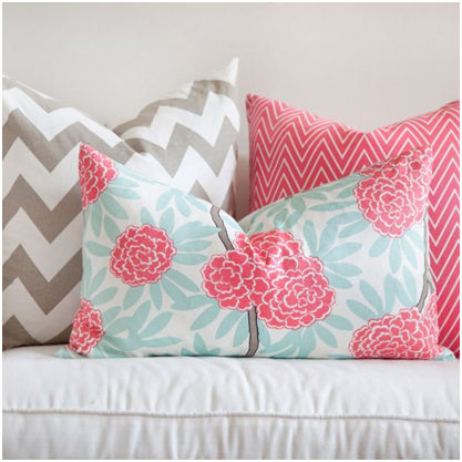
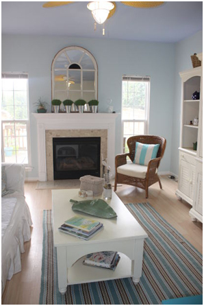
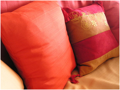
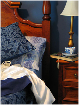
So now that you’ve got your soft backdrop of color on the walls, this does not mean that you can’t add a pop of bright color with your accessories, pillows, furnishings and art (as seen in photos 1 -4) . If you’ve got neutral blue-grey walls, don’t hesitate to add some jewel tones to capture the eye. A bold blue couch, rug or lamp can bring the right deep saturated tone to pull everything together.
If color does not scare you and all these toned down shades don’t get you excited, then another color trend happening right now is one of rich global inspired hues and patterns from around the world. Opulent Moroccan navy blue, Indian Copper, or a red worthy of a Spanish bull ring are all hot trends that can work on walls if you have the guts or as seasoning with accessories.
Despite the color trends, if you remain staunchly committed to beige, at least go for something with a bit of depth and dimension instead of just wimpy ivory. Valspar’s Caramel Gold or a toasty Artisan Tan from Sherwin Williams.
All photos courtesy of Creative Commons