Read Between The Lines: A Review Of The Documentary Helvetica
“Don't confuse legibility with communication,” editor and artist David Carson darkly warns, shifting his gaze from the camera. As the editor for radical music magazine Ray Gun, he is notorious for printing an interview with Bryan Ferry entirely in dingbats—a symbols-only font. “There's thin line between simple, clean, and powerful...and simple, clean, and boring.”
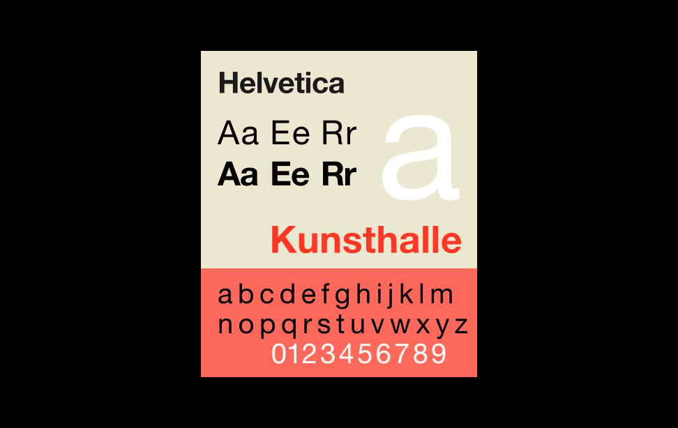
But that's just what the Swiss designers were looking for. In the year 1957, Helvetica (as seen in Photo 1) took off like a landslide down a mountain. It was the ultimate expression of a design revolution in which boring was powerful. During this post war period there was a strong desire to rebuild and reconstruct among designers in Europe. They were looking for a change, and here was a new font that could say anything, and yet disappear everywhere at the same time.
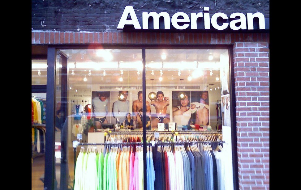
If you think the subject matter of typography is, well, boring, you should watch the documentary Helvetica, directed by newcomer Gary Hustwit. It traces the origins of the font from a small foundry in Switzerland to its rapid proliferation, influencing urban space and the aesthetic of design for generations. An astonishing fifty years later, it has reached the point of total saturation, from IRS tax forms to cheeky American Apparel logos. But the central theme of the film is not just on the ubiquity of a particular typeface, but on the historical and social controversy that surprisingly surrounded its success.
“The life of a designer is the life of a fight—the fight against visual disease,” pronounced Massimo Vignelli, a typographer who used Helvetica to create the American Airlines logo (as seen in Photo 2) in 1966. It’s the same logo we see today. “Typography is white. The space between the black is what makes it. Like music and the space between notes.” Another designer said Helvetica is a culmination of a certain line of thinking—an ending point. “I can’t think of any way to improve it.”
Corporations adopted Helvetica because it was so neutral and efficient, but its smoothness also made it seem human. The last thing they wanted was to seem authoritative or bureaucratic. But the law of diminishing returns eventually began to darken the overwhelming popularity of the typeface. By the 1970s Helvetica was on every street corner and it began to be associated not just with dullness and conformity, but with larger political issues. The counterculture called it the font of fascism—they were morally opposed to the “visual language of corporations and the sponsors of the Vietnam War.”
Artists and designers began inventing “grunge” typefaces that were emotive, unrestricted, and full of contrast. Subversive magazines, album covers, and periodicals stuffed a cornucopia of visual information on every page. Mistakes were suddenly cool.
The designers who first used Helvetica were like parents that were having trouble getting used to the backlash. “This is the disease of postmodernism—they are running around like chickens with their heads cut off, trying to be against what’s modern—trying to be against Helvetica,” Massimo Vignelli proclaimed. Or, as Wim Crouwel put very simply: “Creating order is typography.”
Gary Hustwit’s film uncovers a little-known story about history and culture while encouraging us to examine how the world communicates with us in overt and subliminal ways. Sometimes, a thing is so ordinary it’s worth a second glance.
Photo 1: http://en.wikipedia.org/wiki/File:HelveticaSpecimenCH.svg
Photo 2: http://upload.wikimedia.org/wikipedia/commons/d/df/Americanapparelstorefront.jpg


