Is It Green Or Blue? Yes!
-

- January 1, 2012
- Rob Reed

When you open your eyes, you see color. Optical sensation is fundamental to the way we experience and understand the world. Artists and designers study color because it's a powerful language in itself.
Joseph Albers (1888–1976) was a painter and educator whose 1963 book Interaction of Color forever changed the way color is understood.
Working more through experiment than abstract theory, he likened himself to a chef, with colors being the ingredients. Let's look at the two most basic recipes. (If you don't have a chef's hat, go make one out of paper.)
Relativity of Color
It's possible for one color to appear as two and two colors appear as one, depending on the context.
Colors are only seen in relation to other colors, never in isolation or in the abstract. The colors around and behind one particular color will influence the way that color is seen.
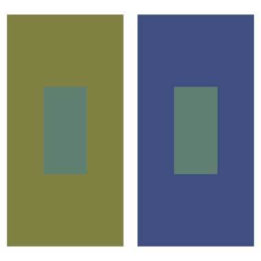
Thus, if you take the same blue-green square and put it in front of two different swatches--one blue, the other green--the colored square transforms. In Photo 1, the same color (in RGB mode, it's 69, 128, 113) changes; it looks bluer in front of the green background and greener in front of the blue.
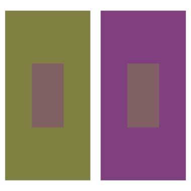
The same effect is at work in Photo 2. The same reddish-brown square (RGB 128, 96, 99) appears warmer in front of the cooler green and cooler in front of the warmer purple.
Just as one color can appear to be two, it's possible for two colors to appear the same. This depends on the color context, as well.
In Photo 3, there are four colors. It appears, though, as if there are only three: a pink, a green, and a peach. Yet, the two peach squares inside the pink, then green, are different hues of peach (RMG 246, 181, 139 and 226, 181, 116, respectively). The smaller squares below the boxes reveal the two varying colors.
Relativity of Value
As with color, value is measured in context. How dark or light something appears is dependent on the character of the space the value is viewed in.
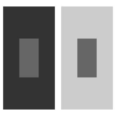
Photo 4 depicts the same grey square (RGB 102, 102, 102) against two different, larger grey squares, one lighter than the other. The effect is that the same grey tone looks radically different inside the larger squares.
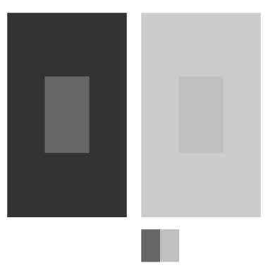
In Photo 5, the inner square on the right has been lightened (now RGB 191, 191, 191) to appear to match the one on the left. Both tones are replicated in the smaller squares below. As you can see, the inner squares are really far from identical.
The best way to learn about these surprising relationships is to make your own. Albers encouraged his students to learn by experimenting and you can do the same with scissors, glue and ordinary paint swatches from the hardware store. If you have a chef's hat, wear that too. It won't help really, but you'll look good in it.
Photos Courtesy of Rob Reed