Production Designer Adam Stockhausen Invites You to "The Grand Budapest Hotel"
-

- March 6, 2014
- Laura Blum
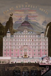


Perched atop an alpine idylia, the Grand Budapest Hotel draws you into its just-so scene like a snow globe. Sugarplum pinks and purples coat its dreamy facade (as seen in photo 1), but enter inside and bounce off the walls of Mitteleuropa's most inspiriting establishment. The colors alone are a tonic.
Welcome to The Grand Budapest Hotel, Wes Anderson's latest adventure in the art of the deadpan. Shot mainly in the German town of Görlitz on the Polish-Czech border, the film takes place in the fictitious Republic of Żubrówka, which tellingly shares its name with a Polish vodka.
Fantastic Mr. Anderson has been making eyes pop since Bottle Rocket, his rousing 1996 debut. Now he's back with his signature arch style that has won him a cult-like following. Among his visual bag of tricks is production designer Adam Stockhausen, who collaborated on The Darjeeling Limited and Moonrise Kingdom and who is versed in the indie director's precise and planned ways.
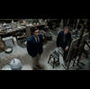
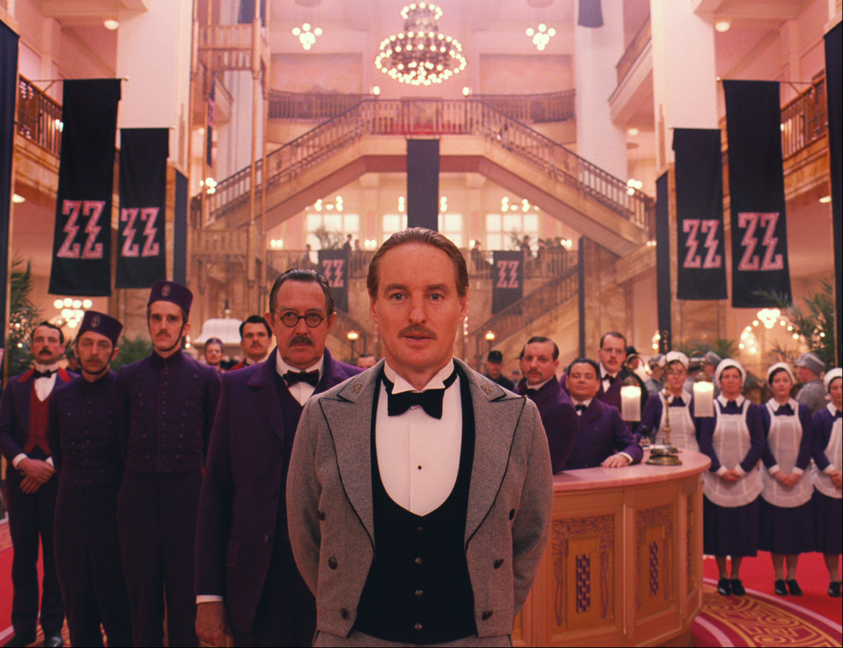
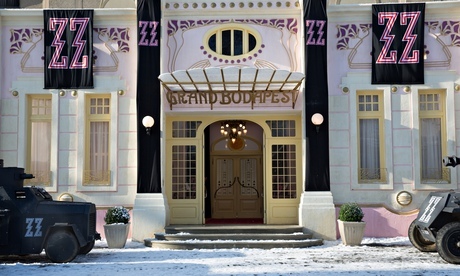
Stockhausen segued from his Oscar-nominated work on Steve McQueen's slave drama 12 Years a Slave into the whimsical world of Anderson and the Viennese author whose writings he drew on, Stefan Zweig. To lodge this time-shifting story within a story, the award-winning production designer decked out the Grand Hotel lobby in Old World charm for the 1930s, only to shred all traces of opulence as it fell under the Iron Curtain during the '60s. Along the way the hotel was commandeered by the fascist "Zig-Zags," as marked by pink-and-black party banners (as seen in photos 2, 3, and 4).
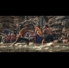
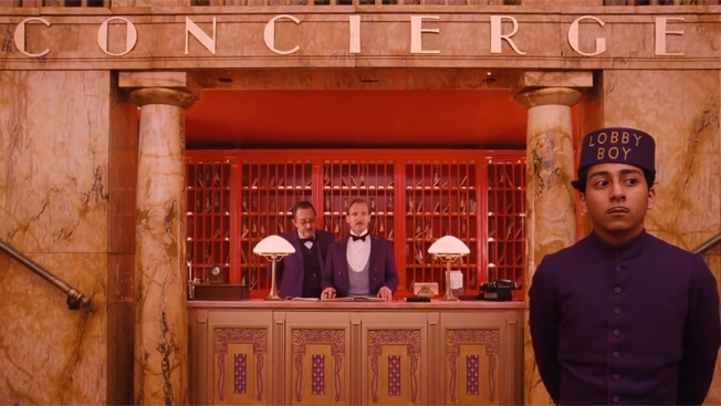
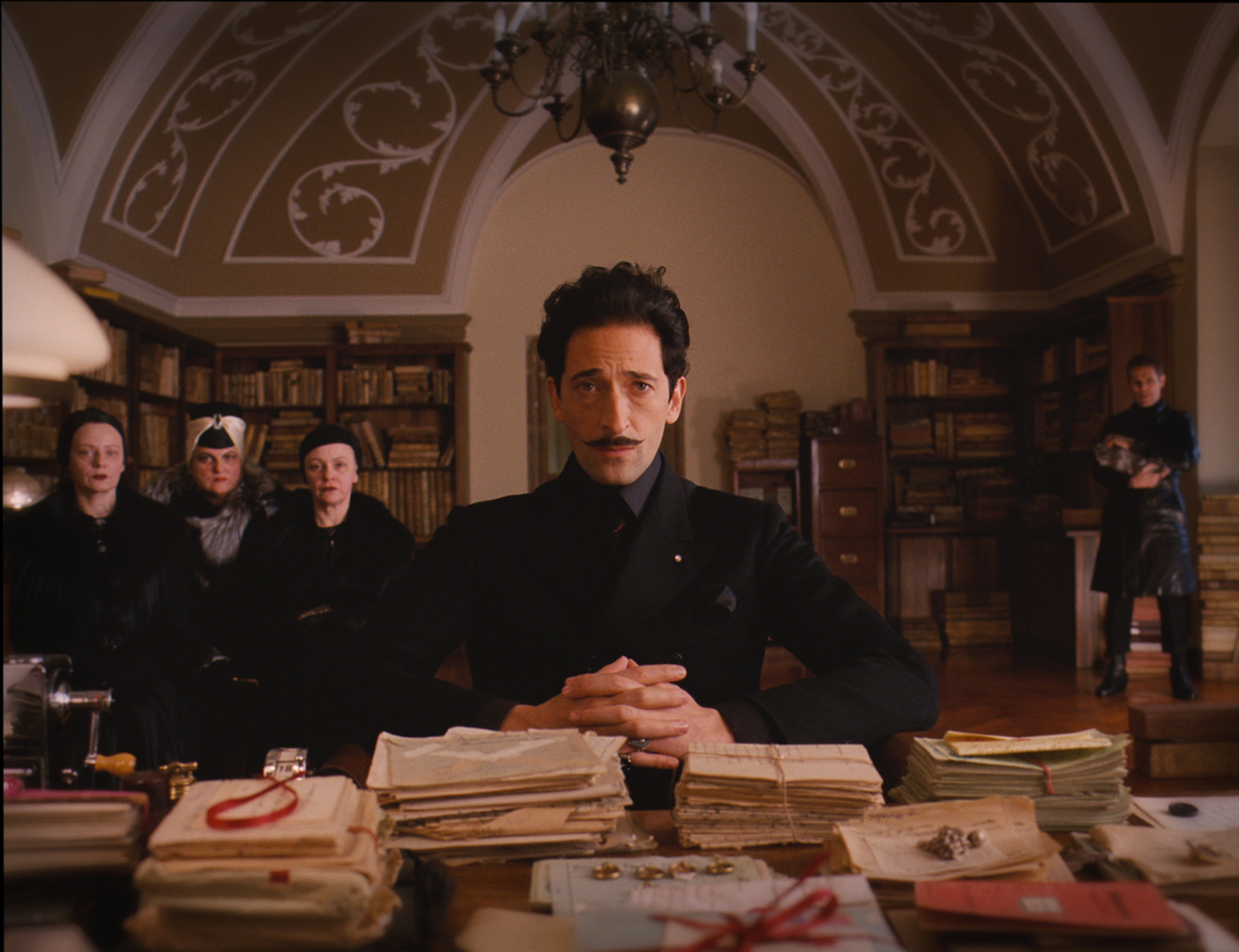
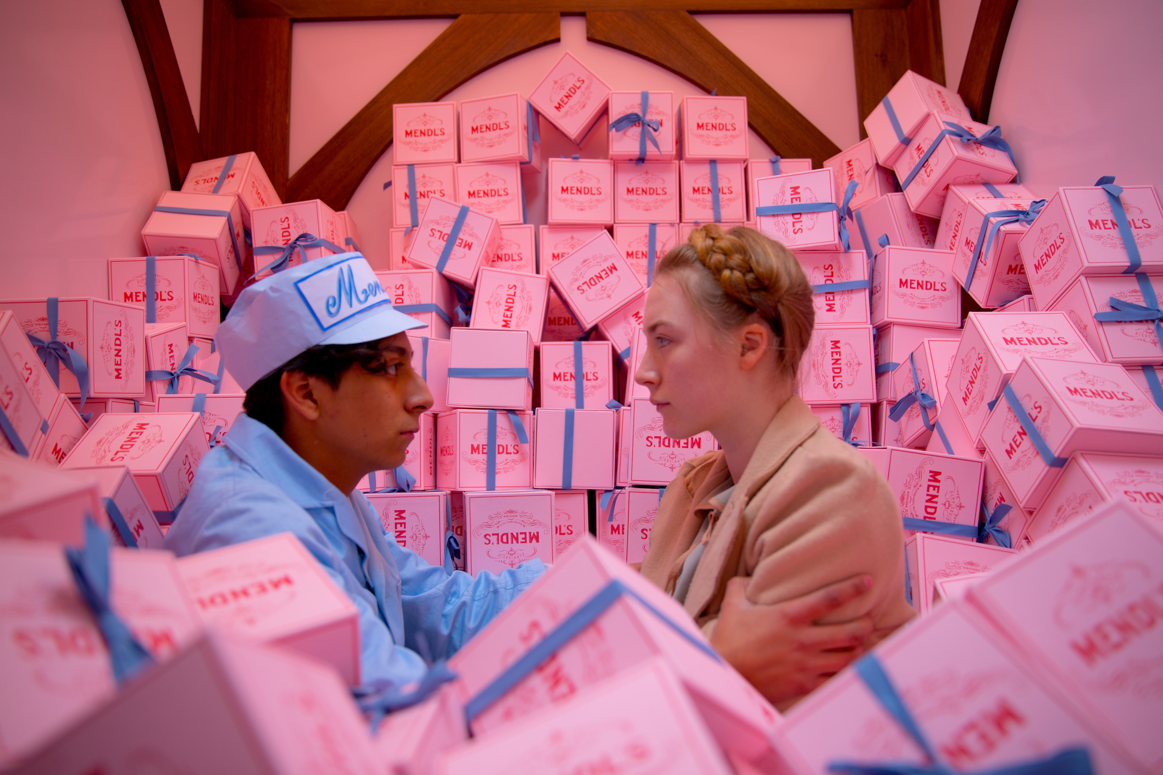
This being a Wes Anderson film, the set is meant convey a certain nostalgia for a vanishing world, and here that loss is personified by the great concierge Gustave H (Ralph Fiennes). Monsieur Gustave runs the early incarnation of the Grand Hotel with fragrant panache and the able assist of his lobby boy Zero Moustafa (Tony Revolori). Gustave's obliging service ethic extends to the private pleasures he dispenses to affluent elderly customers such as Madame D (Tilda Swinton). When he receives news of her death, the purple-uniformed Gustave sets out for her Lutz manor house, with Zero in tow. There he discovers that he has inherited her most valuable painting -- and that he is being implicated in her murder. Hot on his trail are the grey-clad Captain of the Lutz Military Police (Edward Norton) and a bleak henchman (Willem Dafoe) serving Madame D's arch-evil son Dmitri (Adrien Brody). If villainy dresses darkly in Żubrówka, by contrast, candy-hued pastries baked by Zero's wife (Saoirse Ronan) and the color-coded concierges of the world's finest hotels (including Bill Murray, Fisher Stevens and Bob Balaban) all play heroic roles as the saga shifts into a pacy caper, replete with a prison escape and hot pursuit over snowy slopes (as seen in photos 5 - 7).
To start, though, The Grand Budapest Hotel unfolds in a bookish key. An author (Tom Wilkinson) who is venerated enough to posthumously merit a courtyard sculpture recounts a journey to a spa hotel that he took as a middle-aged man (Jude Law) and met its owner, Mr. Moustafa (F. Murray Abraham). That establishment was of course the Grand Budapest Hotel, a mite past its glory but still preserving refined airs. thalo.com got on the line with Stockhausen to hear his own Grand Hotel exploits, beginning with the abandoned 18th-century department store that he found for the titular hotel.
thalo: How did you come to use the Gorlitzer Warenhaus -- a department store -- instead of a hotel?
Adam Stockhausen: Thinking back on it I can't believe we ever thought it'd be possible to film in a hotel. We never would have been able to take an operating hotel and kick everyone out. So we started looking at places that were no longer functioning. The problem with that is that they're often falling apart really badly. We saw places that must have been amazing before the ceiling fell in and all the plaster fell off the wall. What was so fantastic about this department store is that it was still in wonderful condition. So we were able to come in and build our scenery without spending an arm and a leg just making the place inhabitable.
th: In a recent press conference, Wes Anderson said that he especially drew on the Stefan Zweig novels Beware of Pity and The Post Office as well as on his memoir The World of Yesterday. Did you cull visual information from these books?
AS: Zweig was not a huge visual reference for me. For me the more important references were film as well as the architecture where we were, in a part of eastern-most Germany that's historically tied to the Czech Republic and the area of Saxony and Bohemia. It was an area of constantly shifting borders and a really rich architectural tradition. The time we were looking at in particular is this mixture right as Jugendstil -- the local term for Art Noveau -- is part of the world. But it's not a clean, perfect, singular style. Art Deco is just starting to bubble up and there are a lot of other trends going on at the same time. We were looking at that architectural history all around us, and the department store we were shooting in was a shining example of this, so we wanted to go with it and embrace it. And we drove around and pulled a lot of details from existing buildings.
th: How challenging was it to square Görlitz's mishmash of Gothic, Renaissance, Baroque, Historicist and Art Nouveau architecture for Budapest's body double?
AS: When you go there it all kind of works. When you open up a book on Art Nouveau, everything matches. You're looking a strictly curated collection of images. But when you starting walking around you see elements of these styles altogether, but you see them within the context that they grew up in. In Görlitz there is this amazing Jugendstil department store, but surrounding it are these Baroque buildings from the 1500s. The whole comes out looking right together. In particular the earlier buildings in Görlitz are very brightly painted. They're pastel blues and tangerines and pinks have bright yellowy ochres, and that style worked really well and added to the confection quality.
th: This brings to mind the Bohemian towns of Karlovy Vary and Český Krumlov. Did you look around the Czech Republic?
AS: We spent a lot of time at the Grandhotel Pupp in Karlovy Vary looking at detail. And a chair for the '60s-era lobby came from a bathhouse on the strip along the river in Karlovy Vary. In Prague we looked at the murals of the opulent Municipal House, or Obecní dům. We also looked at the tiles and glass work there.
th: What were some of the films that Wes suggested watching?
AS: We looked at a Bergman film called The Silence. The sequence of the little boy walking around the hotel was an important visual reference for us, and the hallways and hotel room doors were something we definitely pulled from. Some of the other films were The Shop Around the Corner, To Be or Not to Be and The Life and Death of Colonel Blimp. We were especially looking at the baths in Colonal Blimp.
th: Were there any artists whose paintings you looked to?
AS: We used Gustav Klimt pretty significantly. He was appropriately from the Vienna Secession movement, so he was of the right time and place. But the most important one was Caspar David Friedrich, a German painter of the 19th century. His landscapes of that part of the world were amazing and evocative and had just the right Romantic surge to them, real flair. We ended up using several of his paintings in the lobby. And one of his paintings became the inspiration for the huge mural that you see in the dining room.
th: What other visual sources did you find helpful?
AS: There's a specific style of postcard called a "photochrom." It was developed in these tinted images that were very popular in the '20s and '30s. There's a wonderful collection in The Library of Congress. They were really useful to us, both in terms of specific details like fountains and colonnades and funicular trains. But more importantly, when you take them together as a whole package and you start leafing through them they let you explore this whole lost world of travel, but not the places like Paris or Rome that come immediately to mind. It's different corners of Europe that you're not used to looking at -- mountaintop hotels -- and there's a whole world inside them.
th: At the press conference Jeff Goldblum (who plays Madame D's estate lawyer) and Willem Dafoe marvelled at the animated line drawings that Wes Anderson created for each actor. Did he craft animatics for the set?
AS: Wes does thumbnail storyboards to almost all of the shots in the entire film. Later those get developed into more finished storyboard frames and then they're animated and cut together so that he can feel the pacing and timing of the cuts and whether or not the sequences are working together. These little thumbnail drawings of each frame give a particular sense of scale and camera movement, since he usually has very specific camera moves. As we were considering whether something would be an actual location or a miniature model, it all depended on whether it's a sideways tracking camera move or a zoom or whether the camera is booming up or spinning 360 degrees around. Those thumbnails helped us through that process. But sometimes we did a first round of thumbnails and then I made maps of the set to match what Wes was thinking so that the camera wouldn't bump into a wall. So we also worked forwards and backwards.
th: What was the process of meshing the life-sized set with the miniature model handcrafted for stop-motion animation?
AS: The design is dependent on the depth of the shot. For instance, in Budapest -- the introduction to the hotel where the camera slides along from a mountain vista with a stag on a spire of rock through the light and sees the hotel sitting on a hilltop with a funicular train rising up from the little town below -- that whole piece was developed in miniature and then we had to figure out where the live action, full-scale scenery takes over in those series of shots and how we piece the whole together. That process is worked out in the storyboarding process.
th: How did it affect your work that the film was shot in three aspect ratios?
AS: We had to keep in mind which aspect ratio we were in at any given time. Very often we were working on how to frame windows and door frames and ceilings and rooms with a particular aspect ratio. For instance, the little window under the storeroom where Gustave hides the Boy with Apple painting lines up with the 1.851:1 frame it was shot in.
th: How did the arc of the hotel mirror the arc of the story?
AS: The hotel in the 1930s is really an embodiment of Gustave's personality and the world he stands for. It's proper; it's well mannered; everything is in its place. There's a luxury to it and it's well kept. It's not idle but it's comfortable and things are done the way they should be done. That world is lost. It gets obliterated and passed over by totalitarian ways of seeing the world and that happens to the hotel as well.
Under Communism it goes through a painful renovation and it's holding on by a thread. So the memories remain of what had been before but there's not too much left to see. We did that by padding over the same set with plastic and wood and florescent light panels. It was still the same space but it was almost completely changed. Every surface had been covered over and the detail had not been given a chance to linger. But it became its own aesthetic, all green and orange and plastic and carpet.
th: How was the palette arrived at?
AS: The colors from the '30s came pretty directly from Wes. He knew from the very beginning that the hotel in the '30s was going to be pink and that the wardrobe would be in purple-plum tones and that the concierge desk would be red. We ended up doing hundreds of samples to get just the right color and to make the colors work together. Pink, purple, red, yellow and gold -- that was the palette -- don't automatically go together. So we did a lot of work to get the balance right.
For the '60s colors he knew the direction he wanted to go in. When you think back to household objects of that time there's a really strong color palette. So I went to the prophouse at Babelsberg in Potsdam, where we were prepping the film, and I started grabbing things. There were lamps, flashlights, a couple of ashtrays, some printed material and things like that. We lined them all up and took pictures of them and said, "These colors are great. Let's use them."
th: Anderson often likes to riff on symmetry. What's behind this?
AS: We tend to lay things out and not be afraid of the center and putting things right in the middle. When you do that things tend to line up symmetrically. But it's certainly not a rule that I would feel couldn't be broken. We don't really talk about it and say it has to be like this or like that.
th: How did you work with costume designer Milena Canonero?
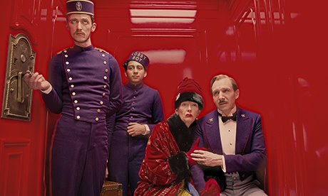
AS: We definitely worked very closely. The costume department and the art department were right next to each other upstairs in the department store. In this film in particular the colors were so strong that they really had to be integrated (as seen in photo 8) early on. We were thinking about using purple and pink and yellow, and if they hadn't worked together it could have been a disaster. So I'd meet with Wes about colors for the scenery and every day I'd go to Milena and say, "Look, this is what we're thinking of doing; what are you thinking?" and we'd hold up swatches of paint and swatches of color and say, "Ok, this looks good."
th: How tricky was it to come up with the Nazi-styled ZigZag banners?
AS: The trick in designing these banners was that they had to be reminiscent of the political history but couldn't be so exact that they'd be terrifying. We did a first pass with a red backround and a white circle and the zigzags in black, and it was just too close. There was nothing lighthearted about it. It had to go further away to be okay (as seen in photo 9).
th: How did you use color to evoke a sense of fascism in contrast with the civilized climate of the hotel?
AS: There's a progression of greys that then become all black. By letting the black be completely black and the color be not just a little bit colorful but explosively, exuberantly colorful, the world of Gustave and the world of the ZigZags couldn't be farther apart. And then Madame D's house, Schloss Lutz, had an incredible richness of detail and was heavily wooden, but it became darker and more forbidding -- and also different. When you're in Budapest you don't see very much wood and what wood there is is gold. In the schloss it's all wood, so it separated itself as a different chapter of the story.
th: How did working on 12 Years a Slave differ from The Grand Budapest Hotel ?
AS: There was a major similarity, actually. The work started at the same place, and that is: you don't just make it up. In both instances we were trying to find very specific details and then let them be authentic and bring them forward to be seen. Of course it's different because in one it's historical and we were trying to tell the story truthfully, and in another it's a fictional story. But finding detail of ironwork in slave cells is similar to finding the colors of the houses in Görlitz and being true to those colors. Each one is very specific and very particular.
How they're different is beyond just the historical events versus fictional narrative. The way of shooting each is completely different. With Wes the specifically designed camera moves and not building anything you don't see is the inverse from Steve McQueen. Steve really wants a completed world -- a 360-degree surrounding -- and to have it feel very real and not at all like scenery so he can come in and let the rehearsal bring out the truth of the story in a way that isn't inhibited by sets. What we were trying to do was to create this whole silent world so that the camera and Steve and the actors could go in and just live there. So that's a different way of thinking about it.
th: Why did you build the entire Grand Hotel lobby?
AS: We did that because when we tracked through all of the storyboarding we realized we were going to see all of it. You could deal wherever you wanted in the lobby because it was fully furnished. But in general we tried to be very careful about maximizing our money and that means not building things you're not going to see.
th: What's your next project?
AS: It's Noah Baumbach's While We're Young. It's about a documentary fimmaker and his wife in their 40s who meet a couple in their 20s, and it's sort of a complicated relationship. It's set in Bushwick, Brooklyn.
Photo credits:
Photo 1: Official poster for "The Grand Budapest Hotel," courtesy of Fox Searchlight Pictures.
Photo 2: (l to r) Larry Pine, Ralph Fiennes and Tony Revolori in "The Grand Budapest Hotel." Photo courtesy of Fox Searchlight Pictures.
Photo 3: Owen Wilson as the hotel concierge under wartime occupation in "The Grand Budapest Hotel." Photo courtesy of Fox Searchlight Pictures.
Photo 4: (l to r) Jason Schwartzman as hotel concierge, Jude Law as Young Author and director Wes Anderson on the '60s set of "The Grand Budapest Hotel." Photo courtesy of Fox Searchlight Pictures.
Photo 5: Edward Norton as Captain of the Lutz Military Police Henckels in "The Grand Budapest Hotel." Photo courtesy of Fox Searchlight Pictures.
Photo 6: Adrien Brody as Dmitri Desgoffe-und-Taxis in Schloss Lutz in "The Grand Budapest Hotel." Photo courtesy of Fox Searchlight Pictures.
Photo 7: (r to l) Saoirse Ronan as Agatha and Tony Revolori as Zero Moustafa in "The Grand Budapest Hotel." Photo courtesy of Fox Searchlight Pictures.
Photo 8: (l to r) Paul Schlase, Tony Revolori, Tilda Swinton and Ralph Fiennes in the red elevator of "The Grand Budapest Hotel." Photo by Martin Scali courtesy of Fox Searchlight Pictures.
Photo 9: The Grand Hotel as ZigZag barracks in "The Grand Budapest Hotel." Photo courtesy of Fox Searchlight Pictures.