'Design Is One': Interview with Kathy Brew and Roberto Guerra
-

- October 18, 2013
- Laura Blum

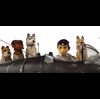
Design is One: Lella and Massimo Vignelli is designed to show how a couple of the world's most impactful designers collaborate. Directors Kathy Brew and Roberto Guerra may have taken a pointer from Mr. Vignelli's quote early on in the documentary (as seen in photo 1), "Design is not about how things look; it's about how things work."
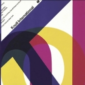
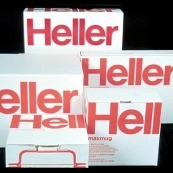
Seeking a broader canvas than their native Italy could have provided, the Vignellis arrived on the New York scene in 1957. They quickly began tidying up American aesthetics ranging from corporate logos for American Airlines, Bloomingdales and Ford to New York’s subway signage and maps, Venini lamps and furniture for Poltrona Frau. Taken together with such other signature projects as branding for Knoll International and dinnerware for Heller, the Vignellis' imprimateur is broadly recognized (as seen in photos 2-3). thalo spoke with the filmmakers about that imprimateur and how it figured in their film.
thalo: How did you incorporate the Vignellis' design aesthetic in your film?
RG: As we were shooting, it was very important to disappear, to be as transparent as possible and not to try to show too much about the design of the image itself, because that interferes with the perception of it. Most of the film is portraits, so if you overdesign, you prevent people from having an intimate relationship with the subject. So hopefully the frame, the fact that it's a camera that is shooting -- all of that disappears.
th: Is the title a wink to Viennese philosopher Wittgenstein's famous remark, "Ethics and aesthetics are one"?
KB: We picked it up from one of Massimo's books, which is titled Design Is One. That was basically going with what the Vignellis' philosophy is, "If you can design one thing, you can design everything." And that's where he says, "from the spoon to the city." They are really about unified principles in all aspects of design. And that does come from the Italian.
th: Even people who've never heard of the Vignellis are steeped in their work. Is it fair to suggest that you chose to focus the film broadly in order to reflect the scope of the Vignellis' design and the experience of the public?
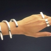
KB: Yes. It was a high bar to do a film on the Vignellis because of their high standard, but our challenge was that they're not niche designers. Massimo says they design everything. In this world of specialization, you're a graphic designer; you're an industrial designer; you're an interior designer -- but they do it all. So the challenge was to show some of the major projects across the spectrum to show that the breadth of their work: that they do graphics; they do furniture; they do jewelry; they do clothing; they do interiors (as seen in photo 4). Richard Meier only works on his books.
RG: Because we weren't having access to them creating as much, it was important to show the breadth and range of their work as much as possible. It's in the editing that we came up some these other ideas like the interstitial things with the music and other things with different elements of the kind of work they did.
th: What inspired your camerawork?
RG: A lot of it is hand-held like the tradition of cinema verite, which doesn't have an aesthetic framework as such, but a conceptual thing of trying to make it as natural as possible in the approach to the subject. So if you vanish and there's no conception of a framewok that is visible, it's like you just see the paintings, you don't see the frame any more. You are in contact with the Vignellis. We disappear -- no fingerprints.
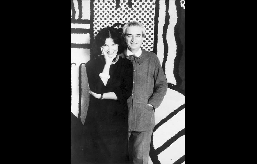
th: On-camera commentators from Michael Beirut of Pentagram to architect Richard Meier to graphic designer Milton Glaser noted the couple's division of labor. What struck you most about their working partnership (as seen in photo 5)?
KB: They have complimentary talents and skills, so it's that idea of two heads being better than one. In the film Massimo says, "I am the pencil; she is the criticism." She would come and say, “It’s good; it’s bad.” Or it would be an interior job and she would take over and take care of the whole thing. She puts on the breaks; he's the dreamer. She brings it down to reality and together they come up with their exquisite designs.
th: The Vignellis introduced Helvetica to America in the mid-60s, making it a hallmark of their design. Why that typeface?
KB: They're basically minimalists. They like purity of form, simplicity, legibility -- and something like Helvetica without all the flourishes is very, very readable. Look at how ubiqutious it is in today's graphic information world.
th: The Vignellis are full of good advice for creators. Which especially resonates for you?
KB: They make a distinction between artists and designers. For Massimo, you create for a need and you create for a client and you do what they need and not necessarily what it is they want. Roberto would say you always create for yourself first and you hope that you're creating for an audience. I'd also make that distinction between filmmakers/artists and designers.
th: Thanks for letting us trespass on the Vignellis' private world. What guided the decision to train your lens on their personalities?
KB: A big challenge was that because they're so eminent -- eminence grises -- most of their work was already created. So it was much more about getting inside their heads and letting the audience get to meet them in a way to understand their canon, their philosophy, their experience, their humanity, their humor. Catalogs show you people's work. Films help you in that they're the next best thing to being there. We hope that we offer you an intimate access into their thinking and their dynamic through the film.
Photo credits:
Photo 1 - "Design Is One" poster courtesy of First Run Features.
Photo 2 - Knoll International design courtesy of Vignelli Associates.
Photo 3 - Heller boxes courtesy of Vignelli Associates.
Photo 4 - jewelry courtesy of Vignelli Associates.
Photo 5 - Lella and Massimo Vignelli courtesy of Vignelli Associates..