What Works On the Web Today?
Online trends change almost constantly, so it’s often hard to know what works on the web today. But while five years ago we had to make best guesses, now we have best practices to follow. And if you’ve ever rolled your eyes at animated graphics, cutesy fonts and garish colors, you’ll be happy to know that minimal, tasteful and design-oriented is now the name of the game.
Yes, the wild web can seem like an ever-changing environment. What worked online in the past might be completely outdated now, so to present your best face to the internet world, it’s important to re-evaluate your site from time to time.
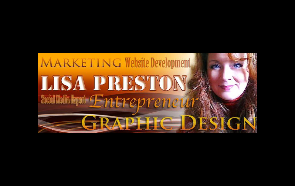
“There has been a natural progression with web and graphic design over time, much like fashion — certain designs and colors seem to appeal during different periods, and fads come and go, like Web2.0 designs,” explains graphic artist and web designer Lisa Preston (as seen in photo 1).
Keep it Simple
When it comes to general web design and layout, Preston says we’ve graduated from visually overwhelming, busy-looking sites with animations and obvious table borders to sleek, minimal designs with two or three columns that highlight the content. She likens the older style to grandma’s living room, “filled with flowery upholstery and every corner crammed with interesting knick-knacks,” and the newer trend to “a room designed with lots of space, minimal colors or distractions and… an eye to traffic flow,” like those created by professional designers.
Integrated Graphics
As a graphic artist, Preston obviously loves images — but as spice rather than the main dish. She likes to “create a site where all the graphic elements make a statement, are original and unique, and flow together to please the eye.” She also prefers to keep any heavy graphics in the background or header so visitors don’t get distracted from the content.
An example of a site she designed recently, which uses lots of graphics but puts them together in a complementary, flowing way, is Tony Blake’s 365cigars.com (as seen in photo 2).
Words and Colors
Light backgrounds with dark type work best for copy because it’s easiest to read. “If the background image is a photo or design, I like to choose a dark complimentary color from that image for headlines and post titles, and keep the content a few shades darker,” Preston says.
Fonts have also evolved over time. “I can remember when people used Papyrus or Comic Sans fonts regularly — and today it would be a huge faux pas,” Preston points out. She tends to choose those that are easy to read and web-friendly for easy browser compatibility. If you want to use something unusual, it’s best to keep it in the header or other graphics.
Show Off Your Work
If you’ve got a portfolio site, Preston recommends using a “lightbox” effect to serve up your images. This is where the full picture pops up with a translucent darkened background when you click on a thumbnail of the shot, similar to how Facebook now shows photos. The strategy focuses attention on the picture and “allows you to populate a gallery or portfolio with many images on a single page, which is far better for the user,” explains Preston.
Video sites can work the same way, but for a more seamless experience, Preston prefers putting a matching “skin” or graphic border around each video. That way the design’s integrity is maintained, and viewers don’t need to wait for pop-ups.
Easy Navigation
Clear navigation is an integral part of a well-designed site, and Preston recommends following established best practices. People expect to see a “Home” or “Main Page” button near the top, and a navigation list at the top or side that stays consistent on every page. Helpful additions include “breadcrumb” navigation at the top of each post, which lets people see at a glance where they are.
WordPress offers a great platform option “for design versatility, ease-of-use for brand new users and novices, thousands of interactive plugins that help incorporate unique blends of interactivity, and creating an original brand based on easy-to-implement third party applications,” says Preston. If you want to go further, or use a web designer, consider CSS (cascading style sheets) which allow you to change the look and feel of an entire site in minutes.
The new kid on the design block is HTML5, and Preston adores it. It’s simpler than older versions of HTML, and puts the focus back on graphic design. Its vision is interactivity, and it “marries CSS and Javascript and browser compatibility in so many ways it's difficult to wrap your arms around the breadth of it,” she says.
And all of this means that “the work that used to take up 60% of a web development project is largely unnecessary.” So no matter what your parameters are, it’s easier than ever to have a great-looking and functional modern website.
All photos courtesy of Lisa Preston


